After thinking about all my ideas and brain storming I decided I want to go with immigration as the societal divide in society I want to base my project. I believe it is something I have been witnessing on social media and in real life a lot and there is a rising tension due to the brexit campaigns in 2016. Since then, I believe the publics eye is turned on the immigrants and also asymlum- seekers at borders in a very negative and hateful way. I want to research reaons and causes for this and dive into ways I can solve or find ways to change the perception of immigrants in publics eye. I believe politicians have a huge role in this matter, the people we vote for who have our ideaologiy we tend to support them in everything as we know they think and believe in the sam ethings as we do. So, many people don’t question things politicians say as we believe they are true and they are on our side. I think this was the way for Brexit in 2016. The election was heavily focused on immigrants and the impact they have on UK. Politicians such as Nigel Farage who have strong opinions on imimgrants created a false and hateful image on immigrants in UK you can see the billboard below, This was my starting point, the poster below made me question and realise the society is now divided and you can clearly see this in our daily life now. I started to research what did people think of this billboard, what were peoples reactions and I found an article how the anti migarnt poster was reported to the police hours after the photo of Nigel posing in front of the billboard was released. It’s the article there are peoples reactions from Twitter which describe the billboard as ‘Nazi’ like propaganda.
Even many politicians in the same party as Nigel Farage declared that they don’t agree with the propaganda he’s doing. Since then, we started to hear many more things about immigrants and they’ve become the hot topic in many articles. The way Brexit campaign showed immigrants as people who are risking the security of the British people and that they are a damage to the society and economy. So, the image politicians created on immigrants was negative and hateful so this started people to talk on social media, there was a lot of negative things circulating on platforms such as Twitter and Facebook. It was creating a misconception. As there as never a fact or information about the impact of immigrants in UK or whether it is negative or positive. So, this was my next step I want to research whether immigrants do have a negative impact on UK economy and society, are the misconceptions circulating on social media true, the memes and videos that people are sharing on immigrants stealing our jobs are they really stealing them?
Misconceptions
There are many misconceptions circulating on social media about immigrants, these misconceptions are usually very negative and hateful. They are creating an image of people who are damaging the society. I did some research on misconceptions on immigrants in UK, and I was shocked at some of the results. There are many articles and websites which give you information and focus on this issue. These misconceptions are spreading across twitter with people just retweeting as it fits their ideology and political views. The more a tweet or post is retweeted the Twitter algorithm places it on the feed and more people can see it and share it as it’s popular and mainstream.
One of the main misconception about immigrants is that “they are everywhere”, many people believe there are huge population of immigrants living in Britain. However, the surveys show people hugely overestimate the proportion of immigrants in Britain with an average guess of 24% when the actual figure is around half that it is 13%. Another misconception is muslim immigrants, Britons are very wrong about the percentage of Muslims in Britain. The average guess is more than four times the actual figure (17% vs the 4% reality).
The government claims that its new “points-based” migration system, introduced through the recently announced immigration bill, will “attract high-skilled workers”. But the proposals actually amount to a two-tier system which makes judgements on income, treats people as economic commodities and makes it impossible for anyone to live in the UK unless they are rich or have a PhD.
The government’s own estimate puts the cost of deliberate misuse of the NHS by overseas visitors at 0.3 per cent of the NHS budget – the majority of this is actually British expats living overseas, who are not “ordinarily resident” in the UK and return to the UK solely to use the NHS outside of the rules.
In fact, most people who come to live in the UK have “no recourse to public funds”, meaning they are not eligible for benefits. Even asylum-seekers, who are barred from working, are left to live on just £5.39 per day, and struggle to support themselves and their families. What’s more, the “hostile environment” denies anyone without documentation the right to benefits, banking, driving licences and employment.
“Far from being soft, our hard border regime already means that many people die on entry to the UK, or are left to the hands of those willing to exploit them.“
The available research also shows that any declines in wages are likely to be greatest for resident workers who are themselves migrants. This is because the skills of new immigrants are likely to be more similar to the skills of migrants already employed in the UK than for those of UK-born workers.
Fullfact.org
This is a website I found when I was reearching abou timmigration and misconceptions, they are a group of independent fact checkers on variety of issues from Coronavirus to immigration. I found a page on immigration and wages, such as how does immigrants effect the wages in UK etc. The website is very easy to follow as it starts with the ‘claim’ which is ithe misconception and then the verdict to either agree or disagree. I believe this is a great way to deal with misconceptions as there are so many misinformation spreading around social media, no one really knows the truth anymore but with organisations like this people can research and get educated very easily.
“The available research also shows that any declines in wages are likely to be greatest for resident workers who are themselves migrants. This is because the skills of new immigrants are likely to be more similar to the skills of migrants already employed in the UK than for those of UK-born workers.”
The evidence show that with the increase of immigration it usually effects the low skill level workers which is the migrant themselves. It proves that their claim is untrue and it has no evidence behind it.
Migration Observatory
Work and study are the most common reasons for moving to the UK – together making up 71% of long-term immigration in 2018 – while asylum is the least common reason. Students and workers with definite jobs make up most of the entry visas into the country.The family migration make up the very small amount, the evidence show that the image portrayed as the migrants flooding the country it in reality not true, most of them are students who are playing their tuition fees and also workers who are in jobs.
The British public focused more on the immigartion on 2016 as the coversation was at it’s peak and most politicians were using as reason to leave the EU. The conversation of borders and other issues were raised. However, it decreased over the ages as now the NHS and EU is more the hot topic in the news.
I want to focus on social media as well, I want to do some research on how are peoples attitudes on immigrants on social media, who are the users, how does social media effect the divide?
Once I read through the brief, the next stage was to create a mind map of all of my potential ideas for the brief. I started off with reading a ‘how to approach’ section in the brief which guides us on how to start off, it says the first thing you should do is identify a societal divide. For this, I started doing a mind map noting down everything I thought is a potential divide that I see in society or social media. There were few key topics which I was always interested in and that has happened in the recently in society. The main is the political divide in UK and generally across the world with the Trump and Biden election. The political division seems to be the main thing in society which creates hate and tension in society. You can clearly see this on social media, Twitter is always heavy with information and opinions of both sides arguing. If I was to focus on a political divide it would most likely be the Brexit Election in 2016. Or the impact of social media such as the Facebook case focused on data collection and Cambridge Analytica. However, I already made a project on Facebook and data second year, ‘Terms and Conditions’ Exhibition. So I wanted to stay away from the data collection aspect. However, I knew one of the main outcomes from the Brexit election was the tension on between immigrants and the general society. I remember last year, in one of Wendy’s lecturers she showed us the Nigel Farafe Billboard Poster, you can see the image below. This billboard causes many people to report the billboard and it was removed after the public showed so reaction. The billboard was focused on immigrants, a photo was used from a big crowd of immigrants and the title was ‘breaking point’. The billboard was accused of having Nazi like langauge to create hate on immigrants. It showed immigrants as people rushing into the country. I realised when I looked at this iimage was that this billboard was created for an audience in society so they can vote leave, they wanted people to believe that immigarnts are breaking into their country, a false and hateful image of these people. It was later found that the image was not even taken in UK border, which also shows that spread of the fake information in politics to draw voters in. In the end, Brexit did happen and half of the ocuntry voted leave. However, this resulted in UK showing how racist it is, people were tweeting, posting horrible things about immigrants. One of the main lines were ‘ They are stealing our jobs’. I knew there was loads of potential ideas if I focus on immigration. I also thought about racism especially after Black Lives Matter protests in April 2020 during lockdown. I knew this is also a divide in society and racism is a huge problem in society. However, immigration is something close to my heart I am a Turkish immigrant who is living in this society so I could connect with the project using my experience and knowledge I felt like I could create something strong.
There was also the idea of misinformation especially on facebook, from my research on data collection from last year i knew that Facebook was used to psychologically effect peoples voting habits with fake posts and news. I did small research earlier to find out things on Facebook users and instantly it showed that 61% of users aged between 65+ do not understand why certain posts are included in their news feed. 53% of general Facebook users do not understand why they see certain posts on their feed. I believe there is a users lack general knowledge eom social media especially older generation, They don’t understand the algorithm which makes them believe everything they see on social media is true however most of the time is it not. Sometimes I read the comments on some posts, you can clearly see the post is created with exaggerated titles, very misleading and the content is problem is not that severe but the comment section is full of older users commenting hate or arguing with each other about issues. This is a potential idea which is also included in the brief as it is the main issue of social media recently especially with political elections misinformation is a huge deal where even Facebook and Twitter are now taking actions.
I have few ideas which can potentially be developed into a the project for this brief however i am still deciding and we have a group tutorial where have to show our 3 strong approaches I can decide later after some feed back.
I wanted to do another mind map with potential outcomes like things I could create focused on different topics. As I realised there are few topics which interests me and I instantly had few ideas about them.
Misinformation – Digital Workshop
As I was thinking about many users don’t understand why they see certain posts on their feed, they don’t know about algorithms so I thought about a digital workshop with questions and information which tells them with examples things they should avoid doing or be aware when they on social media. This would mainly focus on Facebook as user age is usually higher and parents usually lack knowledge on social media. The workshop is aimed at explaining briefly algorithms and if people are educated on social media and how they should be using it then maybe the misinformation will be decreased people won’t share it without reading or they can identify when they are reading it. It’s similar to like gyms, when you are a member before your first session you should usually have an introduction session so you know how to use the equipments. I don’t know how it would look as visually whether it will be a separate app or a plug in on facebook. It can also work with Twitter as well and misinformation is an issue they have dealing with and especially in election periods it can be a very dark negative chaotic platform from both sides. Also, in the workshop it would have like posts where it would deconstruct it self to give the user an idea on how fake posts are created things they should look out for. I thought visually it would be really good as the user can see and understand different types of posts created for certain users. This idea focuses on education the users and bringing people together from all sides so they can use social media in a positive way.
Another idea is a focused on spreading positivity on social media, I think this focuses on Twitter or Instagram as these are platforms people share and post things regularly. The positivity charts are like a plug in, maybe weekly or monthly each user can get a graph, a chart of how much positive things they have posted on their account. This could be a good way to encourage people to spread more positive tweets or images as everything we share on social media effects other people as well. Instagram has like activity charts where it shows peoples interactions with your account etc so it can easily be a plug in that could be shared around as well. I had this idea from the Output Studio, mental health project.
Another idea is more of an experience and focused on the design aspect. A spacial virtual exhibition which is aimed at information and using design to showcase the impact of social media.
I believe I have few ideas which can potentially be the a good way to answer the brief as I think it is a difficult brief to handle as it wants direct solutions to issues using social media whereas sometimes social media is seen to be the issue creating the divisions but I want to use positive sides of it too. My next stage is to have the group tutorial get some feedback from go forward from there. I will need to do research on social media platforms, algorithms and how do users use social media.
To answer this question I went through the brief, why is there a need for a brief like this, why is society increasing becoming polarized, how can social media improve this? What are the examples social media has positive impact? what is polarization? What are the divides in society that needs action? Which social media platforms play a huge role in division and which ones support? These are the type of questions I was thinking when I was reading the brief
Priority: Social media can be used to promote tolerance and inclusion instead of division and exclusion.
What is the purpose?
The purpose of this brief is to use social media as a positive platform to bring people together, to help the excluded groups in society, to identify a societal divide and draw attention to it, to promote inclusion and reduce polarisation. To promote the positive aspects of social media?
Why is it needed?
The reason I think this project would be beneficial and it is significant because the world we live in is becoming very toxic and polarized. With the events happening around the world, people, countries are hating on each other due to small reasons such as their culture, religion, way of life. There is a growing polarization between real life but also digitally on internet. There are several groups of people are divided either due to politics etc We can clearly see these arguments on our social media such as Twitter, Instagram. When something is trending on Twitter, you know something bad has happened somewhere around the world. it’s like the news, people find things out first on twitter rather than watching the TV or reading the newspaper like before. The communication is so fast, this is an advantage but also disadvantage, an information can be leaked and the world will find out in few minutes. The average session on Twitter is 3.39 minutes. It takes 3 minutes to go through your full feed and find out what’s happened around the world. You are updated in few minutes whereas no one can tell you if what you read is true or not. When I say polarized,
societal divides can be caused by many reasons, many people would say it is due to social media, it feeds us so much information that sometimes it’s not true, it allows people to argue and create a division between groups. People who are siding with the X and then theres people siding with Y. It grows bigger and bigger which then results in real life things such as crime, fights, social disruption. It effects the way behaviour and treat one another.
Today we had a lecture with Sean Rees, a great designer who has worked with amazing big brands and it was great to listen to his knowledge and experiences. The lecture was focused on the word why?. It was aimed at branding and how can we create a brand, in the lecture Sean said branding is more than just a logo, colour palette or strap line. The brand is like the brain, if we lost our memory we would not remember anything about that brand. It’s the things that make us remember the brands that is essential, there was a small activity were parts of logos were missing and we had to guess what it is, most of the logo you know the split second you see it automatically our brain knows what it is. A truly iconic brand has a clear reason for being, is mission driven and stands for something bigger. We saw that iconic brands don’t lead with what they do, they lead with why they do it. As that was the key focus of the lecture to understand why things are done in brands. The next workshop focused on the word why but it was focused on our briefs. Sean wanted to us to answer few questions about our brief so we can figure out what we want to do. The three words are why, how, what?
Why: The Purpose
Why do you do what you do?
What’s your purpose?
What do you believe in?
How: The Process
How do you do what you do?
What makes you unique?
What? – The Result
What do you do?
Whats the end result/product?
Simon Sinek – Start with Why
Sean Rees suggested we should watch this short clip of a ted talk which focused on his lecture, it goes through each point of why, how and what using real life examples such as Apple. How do they manage to be the biggest when there are other products which have exactly the same feature even at cheaper prices. It was eye opening and interesting as it’s a different way of thinking and if I could apply this to my brief it would be a good start.
The next step is to apply these questions to my brief so I can start to figure out what am I trying to make and how can I respond to it.
The next step was a research task about RSA or D&AD winners, we were told to research winners and disect their perspective on the brief, how were they successful, what did they do that can also help our projects. What made the project so successful? How was the idea visualised? So I went through winners on D&AD and chose briefs which focused on social issues which is the topic of my brief.
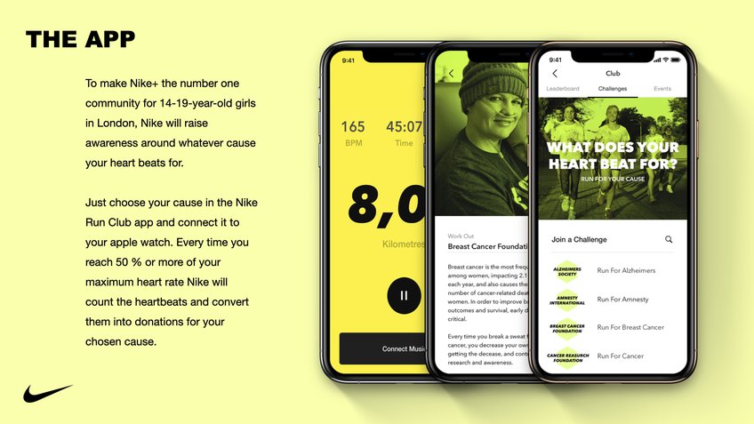
New Blood Entry — What Does Your Heart Beat For?
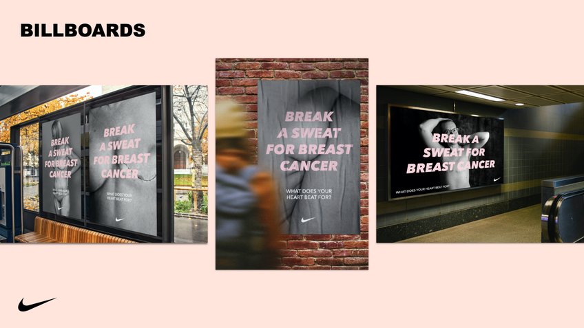
The client for this project was Nike, the winner has created project which focuses on trying to bring the community together by using the Nike Run app they teenagers can make an impact on the issues that they care about. The campaign is called What does your heart beat for? I think the slogan is so intriguing and powerful it allows you to think about issues, problems you care about and gives you the opportunity to do something for those people or groups. The visual language is simple and powerful, the photographs and the clean type work really works and fits to the purpose of the project. It also fits the Nike branding which is contemporary and clean aesthetic style. The outcomes they designed is an app feature which converts peoples running distances which donations to certain organizations which they person (ambassador) chooses. I believe one of the reasons this protect was successful because it is personal, it allows the users, viewers to have an impact on something they believe in and feel that is important. The slogan is powerful, it’s directed at you personally, you have an individual voice and you can do something for it by just doing a simple act of running. It also encourages being active, if you feel like running is not your favourite activity or you don’t feel motivated, with this project you can find something that will motivate you or give you strength to over come the challenges whether it is lack of self confidence, lack of time etc.
The campaign visuals are like I said fits with Nike aesthetic, maybe if I saw this billboard in real life I would probably think it’s a Nike project. So, for that it works well with consistency and understand the clients identity. The posters on billboards also have powerful slogans such as ‘break a sweat for breast cancer’ which is again telling you to be active, to do something an act which is is running for an organization or an issue. The poster visuals are clean and structured through out the campaign so it is consistent. I think it’s the purpose and the campaign features which really makes the project stand out. It can really work on the outside world, as running distances turned into donations by these big organisations does sound really smart.
RSA- Platform of Joy – Hello Hampton!
This is the winner of one of the RSA projects which is the competition my brief is in. The brief in this project is focused on the question how might we unlock joy for people at the train stations? One of the winners of has created a project which involved community workshops in care homes. The process to co-design themed stained-glass windows to be displayed and fitted to the structures of Hampton Court Station whilst providing a unique sense of identity and joy. Each design is unique and created by individuals imaginations. I think this is a great way to involve community into the project as it should reflect the public and have representation. Through this opportunity, these groups were able to project their voices through colours, drawings. I think this project is really great as it’s so simple but so effective, the images are so nice and knowing it was created by individuals in the public really brings it together. They also created a social media page which all these drawings are posted regular. I thin it is very smart and unique it brings the individuals but also turns the station into a more positive and community feeling.
RSA – Nip it in the Boob
How might we use AI to support people to reach a happy, meaningful and productive one hundred year life?
This is also another project which I found really powerful and important as it focuses on breast cancer. Nip it in the Boob’ is an AI driven, interactive service which allows women to record monthly assessments in order to enable early detection of breast cancer at home. This is an issue in society which women usually ignore or avoid talking about. Most women don’t know how to check their breasts and this can really effect some people negatively if they should see the doctor. The project is focused on an app which is a way to record data and keep on track with the assessments. There is a booklet as well which comes to women’s house which has examples 3D shapes 3D shapes that mimic the texture and quality of the mammary gland tissue of a healthy breast and a lump, to help guide women through their checks with confidence. By this way they know how the breast should feel and how it shouldn’t feel as you can see on the image below. By this way, if they feel something abnormal they can immediately contact the doctor. The app allows women to create their unique account which they can track and assess daily. I think this project is very smart and focused on the issue. Home assessment is very important for breast cancer and with an app this makes it really easy to track the assessments. Maybe the app can send out notifications if they haven’t filled the track form in ages. As by this way, the app also reminds women to do it as many people forgot in their daily life routines. I like the visual language it is playful and positive colour palette makes it engaging and relaxing as it is a serious importance issue.
RSA- Platform of Joy – DOT -+ SUM
How might we unlock joy for people at the train stations?
DOT-+SUM is a way-finding system that uses responsive visuals which evolve with the station environment to provide passengers with real-time information about the transport service. This again focuses on how to make the train stations joyful and a positive area. The other project focuses on community workshops using Hampton Court residents however the response is focuses on more technological and data in the train station which can benefit the travelers as well as making the place more interesting. The two approaches work in different ways. This response is a way finding system that uses responsive visuals providing information to transport service. It makes the travelers experiences easier and run more smoothly.
“With a desire to make information on station platforms more engaging, less confusing and stress-free, DOT-+SUM is passenger information system and way finding strategy that evolves with the environment. It provides users of public transport with responsive visuals which correspond to real-time information about the transport service. ” I think this response it very useful and beneficial to the travelers and it didn’t just focus on making the space look pretty with colours or murals etc, the design is also aimed at making the information less confusing and easy for people to navigate around the station. It uses simple visual elements such as shapes and movement to communicate the information rather than words and times as it is in most stations with massive screens. By this way it is less information but it’s engaging. I think this was very inspirational to use a different language rather than words or images, using a different simple system can also be very effective.
Today we had a meeting with our mentor Alex, I have been incharge of organising meetings and communicating with the mentor in the group. So, this was our last meeting with him and we went through our presentations before the client presentations tomorrow. Alex listeened to each of us and gave us few feedbacks and few deetails he thought we could change or improve. With my outcomes, he said the presentation layout was really good especially using full scale images for some outcomes it was clear for the client. He suggested that I should work on the journey map, he said the text is too small and there’s a big paragraph so it’s hard to read but also looks text heavy. In addition, he said maybe add more of the shapes into the journey to blend it in with the project. You can see the final design on the post. I was much happier after changing few things Alex suggested I’m glad he was able to point things as those texts was for to help me during the presentation if I get stuck but soon I also realised it looks too much on the page. Overall, he was very happy with the branding and each of my outcomes.
CLIENT PRESENTATION DAY
Today we did our presentations to our clients, I was so nervous as this was my first time presenting to clients and it was through Microsoft teams so it was a few first times. The presentations went smoothly, i was nervous that I would miss key things out as i was nervous but at the end of the presentation i didn’t regret anything or felt unsure about things I said. I was so happy because I felt like I communicated my purpose, why have I done each thing and explained how it would be useful to our target audience. I hope the client understood my perspective and my respond to their brief. At the beginning of the project, I did struggle I was unsure on how to take this brief, I felt stuck kind of hit a wall but with the advice from Paul and Alex, I slowly brought everything together I used the things in the brief to guide me each step and tried to figure out what am I suppose to do, what am I trying to say to these parents. Overall, as the first live client project, I am very satisfied with my outcomes, I feel good about the things I created and I hope the client feels the same way. At the end of the presentation, they said how amazed they were with each of our responses and that we were able to take this brief way beyond their imagination. They were very pleased and satisfied. They mentioned they will be using parts of our works in there up coming projects which is so exciting to hear! You can find the link to the presentation and design document below.
This is the final design of the planner, as I was writing this post I realised on the design document the planner has few parts missing this is a stupid mistake as I didn’t realise when I was submitting which is very annoying. However, the planner design above is the final outcome and that is how it should look like.
For the fun packages I want to have game cards inside them as well as other items as the games cards will include short instructions on how to play these games. The images below show what client has sent us already existing posters and list of games. I can see that they have just focused on on on texting explaining the games rather than any visuals so for this is weak however it is easy to read and communicates it clearly. However, I think we need to create something that is bit more fun and playful, the posters have loads of text on them which makes it crowded and boring. I picked out three games and I will me making A5 game cards which is mainly aimed the families with online access. I will be using the instructions they used on the posters but creating it using my branding identity.
These are the games I created for the fun packages, there are three of them focused on short fun activities. I was struggling with the visuals as I thought I needed to do illustrations drawings of the games and I had a meeting with Paul as I was concerned. He gave me really positive feedback saying my branding is very consistent and it all works much better compared to few weeks ago. He suggested I should use the abstract shapes in the branding to create the visuals for the games. So with this idea, I went away and I was brain storming what to do , the first game is a Tea towel tag, I distorted the square box on the posters to make it look like towels hanging off, or sheets. I then layered it behind the text in low opacity to blend with the background. The body copy is short and easy to read for the readers using Roc Grotesk medium. The second game card is Call the Colour, this game is aimed at finding different colours around the house and collecting them in the middle. I thought the way to visualise is just use all the shapes in different colours which it works as it shows different colours and it’s eye catchy. Again the visuals are blended into the background with low opacity. The last game is Clear the Area, in this design I used the shapes and divided them in to two parts as the game is about throwing objects to the other side and whoever has the most objects on their side loses. The visual works and you could understand the game. I think the game cards work well and would be very beneficial for families with no online access. I used different variations of colour combinations to keep the tone exciting and playful. I added the logos on to the all the elements.
Mock ups
These are the A5 card mock ups for the games cards which will be in the Fun packages.
SOCIAL MEDIA PRESENCE
I wanted to create posts for their instagram page as social media is a huge platform where many people use to find out about activities or event that are going on around where they live. These posts will be both informative but also just persuading them to check the websites for more information about packages etc. This could be very easily created by the client as the branding is very set and they can replicate it through other social media platforms. The posts are seen below, I kept it very simple, clean layouts which give some information that can be seen shocking or intriguing if you are scrolling down your feed. The posts have playful elements of shapes around the corners to keep the branding consistent. I created total of 6 but so many can be made as there are loads of facts but even photographs can be shared of families if they give consent I just focused on information as that was the main. It has a potential such as instagram stories etc. I used a a project that was focused on importance of quality time in families so I used quotes that was used which is significant and intriguing. I also highlighted the it costs nothing to play games at home, this is a shook factor where it’s large in size so when a parent reads that they might be persuaded and change their mind.
The powerpoint I found is a campaign is again focuses on family quality time and they have given people so many facts and reasons why quality time is essential. They did a survey with a group of parents and asked them their perspective on family quality and most of them agreed family time is essential. They defined quality time in 3 ways such as structured planning, it should be child-centered and time available. I think this has supported my idea on how the campaign should have a deliverable which the parents can use to plan. The weekly planner would be beneficial for parents who always use planners in their daily life, when they are at work etc they can plan which days they have free and can have some family time. So the weekly planner would work really good.
I also read an article about how in the society we live today, children are being so exposed to social media, phones, Ipads, laptops all these tools most of us didn’t have when we were kids, because we didn’t have it we would play outside, go parks, play games with family. Due to the easy access to technology this has a positive but also negative effect on young children.They could find it hard to connect to people as they are so focused on playing games on phones, watching videos. Human interaction, communication is delayed or disrupted due to technology as some people argue.
“Ensure that you have at least one hour a day built up of real moments of connection between you and your child“
Mock ups
Facebook ads was something client was very keen as they do facebook lives for the workshops, I created a mock up tp show how easily the branding can be adapted if necessary and already it looks more positive and communicates the message.
Today we had a lecture from Wendy focused on mapping a journey focused on our target audience. We were told to think about our audience and create a map that shows different situations related to our outcomes as well. Wendy wanted us to identify our audience and in this case for this project it is parents and children. She showed us few examples and the one below has helped me understand the process. The map below focuses on a person having a stroke then it goes through different situations they can go through and how the produced outcomes can effect in positive or negative way. The map is easy to follow with the lines and short explanations above. The map shows the effect before receiving the outcomes and then whilst receiving outcomes. The situations are matched with the feelings either positive or negative as well. I think this would be helpful to think about how would the parent feel, what kind of issues or problems they could face about the campaign as then I can find a solutions.
The next stage was to create my own user map, I was noting down potential users and I thought about 2 different groups of parents and then I focused on children that goes to school. The user journey below is the first edition. The first journey is easy to follow the stops at each point. The first group of parent is they lack confidence, they don’t have much time for quality time. The website and social media presence is aimed at this target audience. The next stop is they are scrolling on facebook and they see the page for the your home is a playground, sport Cardiff. The click the post and go onto the website as it’s interesting. Then they can read about the games, read through the information. I also showed the negative with the dip as they could worry about the games as they lack motivation. They could brush it off thinking they can do it later. However, I could solve this problem with including and showing that they don’t need to buy extra equipment and then highlight the importance of quality time in family. I thought this could get them motivated but also they could have another dip where they are negative about the other things they need to do at home or they think they are so busy. However, the next stop could be on the website they see the page with photos and videos of families playing the games or planners people have completed. By seeing this, this could be a motivating and exciting thing. The last stop is them going home and sharing it with the family.
The second group of parents is individuals who have lack of income for gym membership or outdoor activities. They could also have no online access as that was an audience our clients wanted us to also focus. The first stop is when they take their kids to school they could see the posters and leaflet on the wall. They could pick one up and go through it. The first dip is when they could forget about the activities, lack of time or engagement. However, I think children could be a good way to get the parents motivated, if the children come from school they could tell their family about the packages they sign up to which has game cards and goodies. These things could get the parents excited as they can see their children are excited about it too. The next stage could be signing up for the packages, and they receive the goods. The finally they could start playing these games filling the weekly charts. The last journey is focused on the young audience that goes to school, as I think if schools can give information about this campaign then it could get more audience as they could take the letters home. The last journey again focuses on young audience letting their parents know about the project and motivating the family. The design system I think it works and it’s easy to follow, I’ve used the colours in the branding which fits the project. However, one of the feedbacks from Alex was that the text as too long and small so it was hard to read. I think I should shorten the text. Also, maybe I could add more shapes from the branding elements.
This is the improved version of the user journey. I shortened the text to key words and added other smaller shapes in different colours to represent negative and positive. I think this is much better design that it’s easy for readers to understand. I labelled how each outcome is focused on different target audiences. I think the design of the journey map could have been more experimental such as the length of the lines but I think it is easy to read this way and easy to follow through each shape, I have showed each negative thought with dips. I’m happy with the overall map and it made me realise few points I need to consider such as I think i need to highlight no cost more clearly as it is a way parents will be more motivated to be part of the activities. In addition, I need to do some research on importance of quality time, some facts and statistics which is always helpful to attract an audience and get them to engage. it will also tie in the whole project together I believe as I am emphasising the important of family time which has mental physical and social benefits.
I started creating visuals by firstly choosing the colour scheme. For this project, I wanted to get out of my comfort zone and use a wide range of colours. I believe this would enhance the project especially targeting parents and children. The colour schemes I liked are below I wanted to use variety of vibrant playful colours ranging from light to dark. These colours are playful and they can be seen positive. I picked them out on random from some posters I liked. The colour palette I liked the most is the first set of palettes, there’s 6 colours I liked the dark blue and light pink. I added a yellow tone which is more orange and a dark green which can be contrast with pink and rich yellows. The grey and red is something that could work together. For the type face, I wanted to use bold heavy typefaces for titles, preferably sans serifs as for more informal and playful aesthetics. The fonts I liked the most were Roc Grotesk which is a very popular type face that has variety of variations from condensed to wide styles. It has small but effected features on on letters and I believe it could add a modern touch to the project. The regular type face is really nice for body copy very easy to use and it is very clear. I stayed away from illustrative script which is very common for family projects as it seems family friendly but I wanted to focus on a clear contemporary style which communicates the messages without using illustrations. I am still working on the imagery and the visual elements on this project. I believe finding the colours and type face would be a good start.
The next step I was experimenting with logo works using the ‘Family Fun’. I tried few variations but I think it needs more work. The ones I like are probably the bottom ones with blocks as they seem clear but I feel quiet lost at this point of the project. I believe the logo works can be left for now as I don’t know where I am going. Once I decide on the visual elements I can work on the logo on the side. However, I used the colour scheme and I was very happy with the outcomes. They have a soft tone and they work together.
DEVELOPMENT 1
These are the first set of experiments on the visuals. The main elements are shapes I started the design by the first one on the left. The layering of shapes was something I saw on the mood board I liked the the way it looked on the poster and I tried it by using the slogan I decided to use from my 3 strong concepts. ‘Your home is a playground’ It is a cathy phrase which goes well with the aim of the project which I have explained in earlier posts. The typeface is Roc Grotesk and I used it in the Condensed Extrabold. The type is very heavy and covers most of the shapes. I liked the position on the page however I think it is the text that just feels too much. I believe it is too heavy it doesn’t create the positive playful message. Rather then fitting it into the shapes maybe I could visualise it in a different way. The second visuals in the middle i was playing with the rectangualr boxes and I thought why don’t I add more shapes as I looked back at my 3 concepts I used circles and other various shapes in those potential elements. The shapes I placed them on the top half once again kind of over lapping again still experimenting. I added some text on the bottom half which tells the reader parents to check out the Youtube channel. The slogan sits on the bottom with the small family fun logo. I believe the abstract shapes work nicely it’s playful but I think the bottom half needs some more experimenting. The slogan still sits at the bottom I think the logo just doesn’t work well. The third poster I worked on the shapes at the bottom of the page, still experimenting with the layout.
These are other experiments on posters. The design on the left is something I was playing on about the layout of the shapes and size variations. I thought maybe the scale could be bigger to cover the page and the shapes would be bolder and bigger. The text is also longer and I don’t think this poster works at all. As we had a meeting with Paul today he suggested I need to stick to one branding identity and carry it out consistently through out. The designs at the top and the one at the bottom doesn’t work well as they are different in many ways. I think I will stick to simpler and cleaner aesthetic and smaller shapes. The poster on the right is a developed version of the posters previously. The shapes have stayed the same but I changed few things I didn’t like previously. The slogan is in a moving shape I thought about thinking of slides at parks it reminded me of a children’s playground area and it was playful it adds the moving effect which works nicely as we are trying to get people to be active if we can show this my type and slogans then it would make the message clearer. The small paragraph works fine with the slogan and the logo is placed at the top right on its side. It kind of looks like a sticker that has just been placed I don’t feel so confident about the logo. I think it needs some work.
This is the other experiments on poster designs. The design on the left is for the scientific side which focused on facts. I used the shapes as a percentage to give the science imagery and the number is on colours. I think this needs some more work to create the balanced looked especially what am I trying to tell to the parents with this statistics. I am focused on how to visualise it at this moment. The second poster I was working on the science side of the project. Using statistics to draw parents in on general health concerns in Cardiff. This poster I used the similar shapes layered on the centre and then the text on top. The numbers are in bigger and bolder type compared to the rest. I think this style could be incorporated to the project very nicely and could work well together.
These posterd below are more developed versions, as thought somethiing was missing from the posters it needed a small visual to show drop off your phones. The main focus in this poster is to drop off your phones and have family quality time. The shapes are placed on the bottom of the page as if they have been thrown on to the page like dropped, layering. I thought this would add some movement to the page as we are encouraging being active. The title needed some extra detail to communicate so i added a small clock behind the playground. The clock shows around 8 o clock which is like family time. The main focus is to get parents to priorities family time and that once again their home is a playground. I didn’t use any images or visuals for the games as that will be included on the other elements. I’m thinking of doing game cards that could be in the fun package. I’m still working on the where to place the paragraph of text whether to layer on the shapes or above which would be easier to read.
FINAL POSTER / WELSH – Focused on Priority and Home activities
This is the final posters in welsh and english. I have made few changes as the colours I added more of the dark blue which makes the poster stand out more, I used orange on the areas which needed colour. The clock behind the title works with the main colour on the page which is the blue. I placed the paragraph on the left which doesn’t over lap the shape as readers to read is easier as Paul suggested the text would be harder to recognise if it’s on the shape. In addition, it creates more clarity and good structure. The hierarchy follows from the top title then eye moves downwards to read the text which is in a 13 point size. The type face for all the text is Roc Grotesk but in different styles. The title is Roc Grotesk Condensed ExtraBold and the body copy is Roc Grotesk Medium. I believe this poster is will work very well with the project, it communicates the message with small visuals and its eye catchy. It’s simple and playful which will attract parents. The tone of language is positive and welcoming. There’s no bold aggressive text which can put people off it highlights the game time which I will have a game card to explain how to play the games.
POSTER 2 – Family Bonding – Unity
The second set of posters I wanted to focus on family bonding and how essential it is as a family parents should spend quality time together. The imagery I wanted to use was again using the shapes from my visual elements but not layered different shapes but focusing on simple imagery. I though about unity and how families sit around a table I though if I could show the simple way of how families come together that could communicate my message. I used the circles as peoples in a way like heads. They two big circles symbolise the parents in ways there’s two but it could also work for other types of families as older siblings etc. I didn’t want to generalise drawing these families as there’s loads of types of families and I would be leaving them out. The other circles symbolise the children in different colours. Im experimenting with layouts to find the best one that fits the message. The second one seems to work better and I liked the colours on the blue background it makes it stand out. The stage is to develop this idea with slogans and body text by giving information.
I started to develop the imagery and carry on focusing on the family unity. The shapes create a circle which symbolises game time and the image on the left is the first edition. The title in the middle highlights that quality time is essential, I used a bold typeface to for emphasis. The circles do stand out on the page and I think it needs some development with the visual. The second image is with circles on the right being solid colours whereas the on the left it’s irregular shapes and they have outlines. The message for this is the solid colours symbolise the strong bonds in the family they are full whereas the irregular shape is the weaker bonds without family bonding and quality time. I was speaking to Paul for some advice and he said showing the contrast would be really good to show the reader the effects of no quality time. So the contrast between shapes could be a way to communicate the importance. In addition, it fits the branding identity and consistent with the rest of the posters. I also included a short text to highlight the importance of physical activity mentally and physically can have many benefits. It directs the readers to the youtube channel for videos. the design is simple and modern to fit all parents styles. The next stage is to add the logos and change few more things.
FINAL POSTER – WELSH
These are the final posters for the family bonding aspect. I have created both welsh and english as that was a requirement on the brief. I have added the new logo as I will be explaining after this. I also created a new logo Sport Cardiff which wasn’t included on the outcomes listed by the client but I think it needed a rebrand. It is bold and works well on the poster as well. Overall, I’m very happy with the outcome of these posters it communicates the message in a motivating and informative way. It is simple and structured I also like the way colours work together. the next step is I want to create a website for the project. I want to do some research first ti give me ideas and inspirations.
FUN PACKAGE – PLANNERS
I also started working on the planners which it will come in the family fun package aimed at families with lack of income and who don not have access to internet. The planners I was searching for some ideas but there was nothing that I really liked so I was kind of experimenting. These are the designs I was playing around at the very beginning of the project. As you can see the logos as very different. But this was my starting point. I feel like now my branding is consistent I have decided on a style I just need to reflect this on all the other outcomes. I was struggling at the beginning as there are so many outcomes I want to create and they all need to have the consistent branding so it can work together. The main idea of the planner is that so families can write down the games they have played, which players won or any other notes. I decided on this after Wendys lecture, Nudge or Budge theory. To change peoples behavior or life style it needs to be incorporated into their daily life. A planner or chart seemed the best idea, as if families can do these activities everyday and fill in the planners it means it becomes a daily activity rather than playing games once a week or every month. If they haven’t played in ages they can see from the chart and this could motivate the parents to have some quality time. I think it would really work well with the purpose of the project to get parents motivated. The design needs more work and I will develop using the branding I have created on other posters.
I completely changed my approach and focused on grids rather than big boxes. I think it wasn’t easy to use and too crowded. the grid below is easy to use and it can be adapted to each game. It is simple and works well for the purpose. I created the design using elements from the branding. The grid has the days of the week on the top and the games listed on the side which comes in the pack. I chose 3 games as they were easy and fun to play from the youtube channel. I also left empty space for families to fill out themselves maybe they have games they enjoy playing already. the grid has enough space to stick stickers or write notes. The abstract shapes are placed in the middle layered on top of each other carrying on with the movement theme. I decreased the opacity to 80 as it was too bold the grid wasn’t easy to follow. This way the shapes blend in and creates a nicer effect.
I also added a small information part at the bottom left to let them know if they complete it the charts can be shared on the website and directing them towards the youtube channel if they have online access. Using Roc Grotesk medium and 12 point size. I also added the logos for both your home is a playground but also Sport Cardiff on the bottom right. I feel like the chart looks completed, I don’t think it needs more changes or any more features.
The last few changes that needs to be done is the final logo needs to be added to the chart, and the team name which would make the outcome more personalised for each family. It could be a nice feature to get the family discussing together.
This is the final design for the game chart created for the fun package. I am very happy with the design and how easy it is to use. The game charts will be renewed every week once the packages arrive to families. By this way, they can keep the charts and see their progress as family.
STICKERS –
I also created stickers for the planners for children as they get motivated from these kind of things. They can be seen as rewards once they win games etc. It’s a nice feature to add in to get them motivated and engaged. They are simple designs with words such as completed etc. I used the same colour scheme in different variations.
Sticker mock up
WEBSITE DESIGN
I did a small research into website designs. think it is essential for inspiration and ideas. The design system I am thinking is something simple and clean. Focused on the information and abstract shapes. The images below are inspiration designs I picked out which fits the design system in my head. They are all very clean but also bold. They are focused on the imagery and visuals and clean type structure on the side. I also used images which have shapes as there main element as that is my project as well. I really liked the black first design on the left. the shapes in large scale as light pink on black background work so well it is eye cathy and interesting. It’s so bold and vibrant you can see the shapes on the logo at the top left as well. I really liked the text layering on the shapes which is something I want to try out as well.
First design for the website using some features I liked from the moodboards using my branding visuals. This is the home page which the parents would see when they visit the website. The design system focuses on clarity and easy navigation. I used a simple approach to the menu bar, 4 headings and the logo on the left. The headings are About which will tell the readers about the campaign and the aim of the project. Games is a page to explain how to play these games and maybe include some images that parents could send. If the parents don’t sign up to the packages they can see the games on the website too. Your story focuses on images videos from parents to create a community. Creating a community will create a belonging feelings which is safety and motivation. Parents could be motivated when they see other families enjoying these activities. And lastly, Fun packages is the page parents can find information on how to sign up to the packages and the items included. I used the Roc Grostest consistently in all elements in medium. The overall design I wanted it to be playful and simple. I used title across the whole page to capture the reader. The title highlights the slogan with the underlining which emphasises the word. I also have small paragraphs under the titles to give more information about the project. I think this page needs some improvements as it is very text heavy.The title is too long and too big it makes the page very crowded. One of the feedbacks from Paul was maybe the text could be smaller so it’s easy to read and visually more clean.
I also created the About us but I thought about the feedbacks from the home page. I decided to separate the menu into two sections and have the logo in the middle. It’s an extra details and keeps the eye in the centre. I think it looks nice that way rather than the classic menu on right logo on left. The abstract shapes are placed on the left with the text on the right. It creates a good visual as it’s easy to read the information but it’s till in the same branding style. The page is very simple I think it can still experiment and change aspects however, I believe this is the style I have created all the other outcomes it fits in with the other elements.
logos.
For logo for this project, as first I was working with Family Fun as the logo but the clients really liked ‘your home is a playground’ slogan which captured the project in my opinion. I decided to use it as the campaign name. The idea behind the logo is that I was thinking about play areas and parks. I wanted a playful logo so the flag effect reminded of a slides at kids parks. It captures the moving, being active aspect of the brief. The playground is the main focus in larger font. I think it’s simple and clean works in all different types of outcomes. There are different colour versions to fit all elements.
THE FINAL LOGOS IN WELSH AND ENGLISH
WEBSITE DEVELOPMENT #2
I focused on other pages on the website, this is the Games page which explains how parents can play the games with visuals using the shapes. The information is again centered on the page, I explained the game in short sentences, they’ re all straught forard games anyway. I used few shapes on the right but the main focus is on the instructions. The visual I used foe the game is i used the box shape and distorted to give the towel effect. I used the branding elements to make the visuals as that was one of the struggles or set backs in the priject. I thought about doing illustrations to show the games but illustration is not my strength but also it wouldn’t fit in with the shapes and the overall branding. it was two different styles visuals. I had a short meeting with Paul to discuss my struggle and he gave me very positive and motivating feedback that my branding is more consistent compared to the earlier stages of the project. He suggested i should use these abstract shapes to create the visuals. Overall, I liked the way this page looks, it works well and maybe I could add some images in future or animations. That would be something to work on towards the end.
This is the part they scroll down, they can see the second game, the visual works with the game as it’s about finding different colours in your house. I just created a block of different colours using the wide colour palette.