
FMP – FMP DESIGN DOCUMENT SUBMISSION
FMP – SOME MOCK UPS


FMP – EVALUATION
I think this project was one of the most challenging projects i have ever created. I started off using my experience as the base point and it shaped to be communicating my parents migration journets but also kurdish families journeys in my publication. i am really happy with the outcome and i created a magazine publication focused on the word gurbet and feeling of living away from homeland. This at first wasnt my intention because i didnt realise that word meant missing homeland but through primary research, interviewing many people from turkish designers, turkish actors in cardiff and other creatives who had time to speak to me i realised they are not my focus group they dont share my journey and experience. I decided to i need to speak to the people who raised me and shaped my journey in a new country. At first i think i realised how important my dad was in my life because if he didn’t decide to come here to work and provide a better life us i would have never produced this publication and maybe even did this course. When i was interviewing him i heard so many stories and about his struggles which he never spoke to me about. I hope i have communicated his journey well in the publication. In addition, my mum also told me stories we never spoke about it and heard things that i thought she never thought about it. I think they both shaped this project in a very deep way and then the visualising section was up to me. After weeks of research, interviews, evaluations i decided i wanted to focus on gurbet. Then came the visual process this was the section that was the hardest, i spent weeks trying to create the design, find the best visual language and when i showed it to carol the response was not what i expected. I made mistakes and i had a problem with my design system it wasnt worked this was couple weeks before the submission i had to restart. I faced many problems this project because i was ambitious and i wanted to do something i have neevr done before.the last time i did editorial was in first year and i had mininal knowledge and skill yet in my final major i created a publication that is so in-depth and i poured all of the knowledge i learnt in the last 3 years. Im really happy i pushed myself and made this self directed project which i even wrote the small articles myself, communicated struggles and stories. I faced problems at the beginning emailing designers i didnt hear back from them for weeks. After firs set of interviews i realised they are not the audience i needed, they views and beliefs didnt fit my project so i focused on another group of audience which was my parents. So i spent more time arranging zoom calls, doing the interviews, writing the transcribes then evaluating the outcomes. Once i reflected on these outcomes, i then had to try figure out my position, what was i trying to communicate?
I then had the challenge of designing pages both in english and turkish because my parents chose to communicate in turkish as they explained themselves better. This was hard at points as it was heavy text and i wanted the designs to be really modern and spacious. However i think the final design does look really good, i am really happy with the outcome and i also spent hours correcting all of the alphabet as the keyboard was in english changing each letter to correct turkish letter.
Lastly, Covid was also in our life and i did all of this work in lockdown, we all did get used to it but as everyone in the world it was still challenging at times and i wish we wasn’t able to experience a normal third year such as doing fundraising and having a real graduate show.
Overall, I am really pleased with this project, i pushed myself to the limits and worked day and night to try and make this publication the best thing i have ever done. i wanted to make my family proud and i am really happy with the outcomes. I developed my confidence with speaking to designers artists, arranging meetings, evaluating and creating a self directed project which all of the work belongs to me.
FMP – FINAL OUTCOME
FINAL COVER
Different variations for the cover page, i spoke to David and asked couple of my friends i decided to go with the black version the black and white sections make the design eye catchy and the small dantel just completes the overall design.


post card design
When I was looking at editorial designs David had collected in one of them i found a post card inside the magazine with a illustration that was included in the magazine. This gave me an idea of making own post card that i can include in the magazine that works perfectly with my theme as post cards are sent from loved ones from far away. Even in the magazine theres post cards and photographs of my dad. I think this extra outcome really ties the project together and i keep the design very simple and coherent with the editorial. im really pleased with it. I also decided to print it off to see in person and hopefully after the submission i can print off my editorial and put the postcard inside it.


FINAL PDF
FMP- Social Media Research on Turkish migration and food accounts. @Diasporaturk
When i was doing my migration research I read a paper about this account which shows the turkish migration, they post photographs, stories from migrants the account focuses on migrants struggles when they were far away from homeland and it is actually created as a book to voice the migrants journeys. The screenshots below show my research into their account and mainly they are guest workers form Germany. I wanted more about migrants in uk but it is mainly about guest workers challenges and struggles. The page focuses on gurbet and the feeling of missing turkey.

As you can see all the images are very old and reflects peoples times when they first arrived in the country i read many of them and theres so many stories and different journeys which i think shows a lot of bravery and courage.

I also realised they had english page as they translated each story for more people can rad and learn about their stories.


@Bitesbyburks – Instagram account
I needed Kurdish and Turkish food because as its COVID im not able to go into peoples home and take photo of their dinners they make. So i moved onto food accounts and i recently started follow this account of this guy that cooks really nice Turkish food on instagram. I saw scrolling for some content i came across this dish Eksili kofte, this dish is also made in my culture and in my house very regularly. When i read the description he says the version he made is a Kurdish dish and he always has these foods and i also asked my friends she said she also has this at home very regularly. I decided to use it in my publication to represent dishes that are very similar in Turkish and Kurdish dishes.


(Be)Longing through visual narrative: Mediation of (dis)affect and formation of politics
through photographs and narratives of migration at DiasporaTürk
Mine Gencel Bek, University of Siegen, Germany / Patricia Prieto Blanco University of Brighton, UK
Abstract
“Our article explores how diasporic journeys and identities are remembered and represented through the visual narratives of DiasporaTürk, a Turkish diasporic media presence consisting of a Twitter account, an Instagram page, and two books. These engagements revive past (dis)affects and highlight the contemporary relevance of nostalgia, sorrow and victimization as key themes in the migration experience of ‘guest-workers’ from Turkey. The evidentiary force of the index, inhabiting fictional characters while looking like factual and archival material, seems thus to both acknowledge and validate migrated ‘guest-workers’, who, as subaltern groups, have
otherwise received little praise or recognition in Turkey or ‘host’ countries. At the same time, while converging past and present (dis)affects associated with Turkish migration, DiasporaTürk contributes to reaffirming the reduction and homogenization of official/normative collective memories of migration via concrete visibilities/presences and invisibilities/absences.”


References:
https://www.instagram.com/bitesbyburks/?hl=en-gb
https://www.instagram.com/diasporaturk/?hl=en
https://www.instagram.com/diasporaturk.en/?hl=en
https://journals.sagepub.com/doi/pdf/10.1177/1367877920923356
FMP – Visual development #3 more development
FINAL TYPEFACE + COLOUR
The colour scheme is inspired by the turkish flags, traditional foods and oriental objects in the house such as the turkish hand made carpets. The green is inspired from the kurdish flag, also traditional clothing for weddings and other oriental objects. I think these both colours are vibrant and positive which is the reason i wanted to use them. The title typeface is the same as before I purchased for this project and im really really happy with it. In addition, the body copy was really hard as I have been using a trial font called SAVON TRIAL and i realised it was very expensive so i decided to use a similar typeface and decided to go with crimson pro regular for body copy and medium italic for the pull outs. its a nice italic font which looks really nice on the page especially in a medium weight i think it completes the overall design system.

I also wanted to do some bilingual magazine research just to see whats been done and how i can represent this on the page as i thought i could do with colours and different background colours. The images below are some turkish magazines in turkish and english on the right. The magazine is in turkish and english so on the left they used turkish and right its the english translation the design system is the same for both the position of he pull out quote on the left and the small paragraph next to it. they even have the small text the same at the bottom the only difference is the colour systems. I think this is the easiest way to organise the page layout as if both of them is too different then itll be too much on the page, they also need to look coherent and work well together. The other example is the one on the left, black and yellow design same as the turkish magazine the languages are communicated using different colours and same layout system. Looking at these examples, i can see that i should just do the same and use different colour combinations such as red and white, black and red to show the turkish and english. I also have kurdish language on their which means i can use the green to show the different languages. As my kurdish friend wanted to speak in english.


DEVELOPMENT


GURBET (HOMESICKNESS) -OZDEMIR ERDOGAN
I want to use a song that is about gurbet (homesickness) written years ago this song is really popular and very old used in many films back in the day. When i read the lyrics it really communicates the feeling of living away from home and how hard it is. He says he feels like he’s dying inside is there any news from homeland? The screenshots below show the different variations of the spreads i used many layouts in some it is red and the text is side ways as i wanted to change the tone from the two page reading. I also tried using a photograph of the artist and even layered a dantel. I tried many variations and i asked my peers as well on what they think they said they liked the black version with some parts lighter and low opacity i highlighted the sections which i thought was very deep and needed more attention. Im really happy with the black version and i liked the hierarchy on the page with the title and singer name centered on the page.
song lyrics
https://lyricstranslate.com/en/gurbet-homesickness.html


TURKISH FOOD SHOP RESEARCH – TURKISH BAKER – KURDISH CUISINE
This sections below are the turkish market section in the magazine, i included a pull out quote from a food article related to migration i read earlier. It shows how migrants are attached to their foods and bring them back to the new land they live in. The paragraphs are about the importance of having traditional foods and people supplying these goods are also turkish so its a connection between all of them to provide these ingredients and make these foods at home. the page layout is very similar like the other article spreads, the two columns and the large photograph that covers the full page. The second spread called “firinci fikret” is also will be on the next spread after the turkish food shop. This part is about the baker at the back of the shop and my conversation with him, the layout is in three sections and a pull out quote running in between which i don’t think i like i like the 3 paragraphs i think it looks odd and i need to write a bit more to create a complete look. The last spread is the section about kurdish cousine which is about the similarities between turkish and kurdish food but also the traditional dishes cooked in the houses. I really liked this page and i think im going to leave it as it is the pull out quote in green really adds a colour to the white page you can see the grids i have used.


EXPERIMENTAL LAYOUTS – NEW SPREADS – PSYCHOGEOGRAPHY
These are the experimental pages where i focused on showing of the typeface by covering the full page in very large point size, the turkish breakfast spread was originally just a small subheading but David said you need something that stands out in your face, to break the grid and formal look in other pages such as interviews and articles. these are more experimental and eye catchy showing off the beautiful typeface. The second green spread is i used my pyshcogeography mark because i think it tied the projects together and i added a small description at the bottom and then david said this page can be bold and very eye catchy by very large text. so i added vatan and ozlem which means missing homeland in different words as in turkish expressing you can use so many words.


These are photographs of my father from 15 years ago, he would send these photographs to turkey to show his family he is well and happy. in one of the pics there are photos of us in his bedroom and he sent it to us inside a letter when we were still living in turkey and he was far away. I want to use these in the editorial to add more personality and the nostalgic feeling will be deeper you can tell the traces of memory, migration and live away from home.


TURKISH SHOP RESEARCH & PHOTOGRAPHS
These are all of my photography parts of the research into the Turkish community and Turkish food stores in Swindon. I spoke to baker Fikret which cooks some Turkish foods at the back of the shop. I had a little chat with him and he told a little bit about his life story and how he started as a baker in turkey when he was 10 I think this section of the magazine is really interesting and digs deeper than just speaking to my parents. It reflects the food culture and the importance of traditional foods.


KURDISH FRIEND INTERVIEW –
I decided to include a Kurdish migrant in the project because i think there story should also be included and should be voiced. Originally i was going to interview my mums friend who she’s been friends with years. We always go to her house eat some traditional Kurdish food and i was really interested in her life story. Also, she first moved to Netherlands lived there for couple years then to Birmingham and finally to swindon. However due to health reasons she didn’t feel well so I decided to speak to my best friend bercem, i think this would also be interesting as she’s my age and i wanted to hear her story and how she dealt with moving to uk when she was 7. Mine and her stories are very similar i also moved here around the same age so I was really intrigued and when she was telling me about her story we started to share our stories and realised how similar we both felt such as the difficulty of learning a new language, adapting to school missing your friends. All of these feeling i felt like through bercem i could reflect my story at the same time.
I asked her the same questions i did with other interviewees and she was able to answer them very easily and she said she felt good afterwards. She was able to feel comfortable and she opened up about certain stories. Im really happy she was part of my project.
FMP – Visual development #2 typefaces, colours and more spreads
I now had to decide on the typefaces as i have been using trials fonts that i liked if i decide then i can just carry on designing spreads and making necessary changes. The typefaces u have thinking to use is either KARLA OR GAIA for titles and headlines, The main typefaces should communicate the essence of the publication which is two homes 2 cultures and the merge between life styles. After speaking to David i went with Gaia Display as all he asked me was why do you want to use this font and i said i think its contemporary, its beautiful and all this type i wanted to use a script like more delicate and traditional feeling font and it has these features but the main reason was because of this mood board. I will be mainly using the lower case as it all has the features that i loved.


This is a mood board research about Turkish typography, when I did my research I realised typography scene in Turkey is not so developed as it is in Europe and the designs are either very heavily influenced by European styles or very our dated. The images below show the typefaces that are used around the country, such as sign systems, posters on the streets. It is heavily influenced by the Ottomon turkish script writing, as you can see from the images which are why I decided the Gaia is perfect, the script like very fine corners that blend smoothly into the word and both thick and light sections just made me feel like its a merge of two typefaces. It’s everything I wanted in a typeface so I decided to use it as the main headline and title typeface the next stage is body copy.

FMP- Visual Development #2
I started the process from scratch, my visual language was not right for the content and message i needed to communicate so I started to look at other editorials. With Davids help and looking at some magazines such as justified, drift Amsterdam, Backstage talk and other contemporary magazines I had a new vision and I also realised i need to make this personal as i interviewed my parents so i need to bring something from my childhood. The pinterest board shows the new set of ideas I had and liked they’re lot more clear and bold with colours. I liked the ones with large fonts and images with clean paragraphs. They gave ma good idea about the new visual language and been a good inspiration.

Once I did all of the research and mind maps it was all about designing as the deadline was coming up. I was trying to find symbols and visuals for my editorial reading interviews back with my mum and dad my mum did mentions things like food and caydanlik with is a tea maker but they were too obvious and wasn’t as delicate as a symbol. And then i had the idea, reading through my notes somewhere i wrote dantel and then i realised Melin mentioned when i asked her what else other than food and language connects you back home she said dantel it always reminds me of my grandmother and the time we would go to her house. Then i realised we also had dantel its a common memory, i remember in our house in Turkey we would have loads, dantel is a hand made lace, it is mainly gifted at new weds as gifts for their house. The main reason I wanted to use this in y editorial was i remember we would have these laces in our UK home as couple weeks ago me and mum were going through suitcases and she found them as she didn’t like the style as they re a very traditional she doesn’t use them anymore but they had too much memory she kept them she found them and i was like mum you should to put these under everything back in our first house in uk back in 2007. It was a very weird moment like a like bulb moment, i was like i can use this as a consistent symbol as it reminds me of home and it also symbolises Melin in the publication. these dantels are very traditional and used to be in everyones homes back in the day so i think the perfect visual. I texted mum to send me some photos and the images are below!


I then edited the images on photoshop and created a vector like image to be used in the publication it felt like it was a stamp too like it would be on a post card. i was so happy with this because this is the cultural element my publication needed. This is the red version but it will also be on white background to fit to other pages.

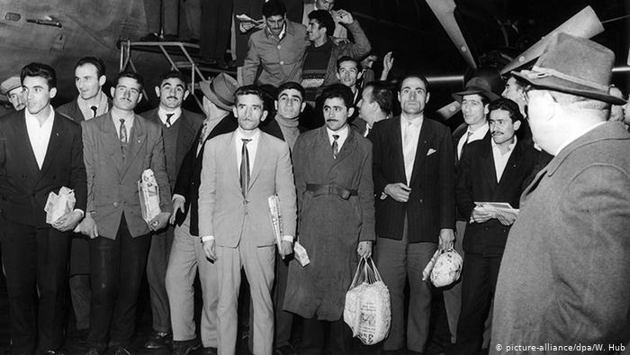
The next stage was to collect photograohs for the articles, the first ones i needed was the article for the turkish migration to UK, in this section i want to use the photograph on the right which is a image of turkish festival back in 2007you can see clearly the mixture of flags and the celebration with all of the iconic buildings at the back. I didnt know whether to use it as colour or black&white. The other image was the one on the left, which is an image showing the turkish men arriving to germany in 1961 which shows the guest worker scheme. The article mentions other migrations such as turkish and german relationshop so i thought this would be really interesting i found this photographs from one of the the articles.

I wanted to use the turkish festival image black and white to show the memory essence and it was more bold this way.

I started t create the first couple of pages, Im really happy with the layout of the first spreads on the right, the article is sits in two paragraphs and the image is half on the page with a pull out quote at the bottom. I think its clean and modern communicates the article i think the problems i had on my other draft was it was too much on the page the visuals i liked just didnt fit in with my style and my skills which is why i never felt like it was good but i feel way more confident now. The other spreads are the second page with the pull out quote this section i wanted to highlight the countries turkish people have lived in and the quote on the right. I used a dantel right in the middle as like a seperater but also connects the pages together just like in my house the dantel would just be just under or over everything.


This image is from a tv series in Turkish television that focuses on 90s turkish life and a drama about the family life in the day. You can see set decor all the laces under everything and on everything in the house its like a little extra protection thats the feel i want the lace just turning on page either randomly or as structured to create that homely living room feeling. A nostalgic feeling brings this publication is a core part of the project as well that runs through each page.

I also did some sketches on the first couple of spreads and the kind of content i want to have. The sketches are very quick and i focused on the visuals i had on my mind which were clean experimental but also straight to the point. I have to decide on my typeface as its a important part of the publication as discussed many times before. The spreads focus on article, large pull out quotes, language as full pages , and other different spreads to create a better tone of language. I think these skeches are great start for me to work on the other sections and im really confident with these layouts as im bringing everything i have worked on and seen in the process.
Things i want to focus on the first half of the publication
PART 1
history of turkish migration
home memory food article to show these feelings can also be positive. I dont want to include the stories of Lebanese people liek before as i think it makes it too confusing i realised i was trying to do too much add everything onto the pages and chucked all the contect together that may not work well together.
language- what is gurbet? where does it come?
Homeland has so many words in Turkish and home doesn’t mean home as in homely feeling in Turkish.
PART 2
interviews mum
interviews dad
Kurdish friend – I decided i want to use Kurdish culture in my publication because grew up with loads of kurdish friends and families around us so i want to also get their experience and see their journey as their traditional foods are different compared to turkish culture. I find it very fascinating and i do love their food. As growing up i realised our cultures do have some similarities especially the kurdish people from turkey both cultures felt like merges.

FMP- TURNING POINT
Today we came back from the easter break and I had a group tutorial with Carol i think this is a turning point in my project. I started off the presentation by short explaning my project and then went into the designs I had done so many pages and i was in mixture of feelings because i should just had no idea if it was good or bad. I went through couple of pages and carol stopped me as i said i wasnt sure on the layout of this page and thr whole feedback came. Firstly she said she basicallt said the typeface is not working as she understand what i tried to do but she thinks there should be another typeface that is more modern and contemporary that can fit to the project. She said she wants to see more visuals symbols about turkey make it more cultural, she said she wants to see more type combinations.
I think this was a huge turning point and i probably created the worst designs i have in thr last three years i think i was looking at wrong inspirations and rushed the visualisation process because the research and content parts took so long. I do feel like i need to push myself and figure this out as soon as possible because i really do believe in this project and the purpose of it so i do want to create a strong outcome.
After speaking to Carol I wanted to hear Davids opinion and his perspective on my designs. We had a 10 minute chat and I showed him my visuals he also agreed with Carol, i had to make significant changes and take a step back and decide what am I trying to communicate along the way I was rushing to make visuals and add all the content I didn’t think about visuals and the purpose. I made a mistake and I was now at a point I realised the problems and issues regarding the designs I had to solve it soon as possible
what am i trying to communicate?

Davids feedback was much more helpful, he suggested think what are you trying to communicate and he suggested I should check out some editorial magazines for inspiration such as justified, backstage talks, drift all of these beautiful editorials made me realise I was going the opposite way. He told me to think about format and how can I communicate these messages such as french folding, he even said bring in your psychogeography work as it would link in nicely. i made the huge mind map above to try understand what i need to do and what is the message i am communicating. From this i realised it needs to be more personal, it needs to focus on community feeling, i need to use symbols and glyphs.
David then as i said recommended editorials that he collected over the years and they were also a huge inspiration it made me realise the style or the visual i looked was just purely wrong and it wasn’t communicating the feeling and message i first intended. From today i deleted all of the spreads i had which was so many and decided to start fresh this was very risky and there was only couple of weeks left until the deadline but i knew i had all of the content i just needed to figure out the visual system. The whole day i did mind maps and just cleared my head from the past stuff that i looked at. David also recommended i should look as Marias work a past graduate where she created a istd project about her greek roots and greek migration to Australia. her work was incredible and it really did make me realise the style i should have taken but i was just too confused.
