
I started the process from scratch, my visual language was not right for the content and message i needed to communicate so I started to look at other editorials. With Davids help and looking at some magazines such as justified, drift Amsterdam, Backstage talk and other contemporary magazines I had a new vision and I also realised i need to make this personal as i interviewed my parents so i need to bring something from my childhood. The pinterest board shows the new set of ideas I had and liked they’re lot more clear and bold with colours. I liked the ones with large fonts and images with clean paragraphs. They gave ma good idea about the new visual language and been a good inspiration.

Once I did all of the research and mind maps it was all about designing as the deadline was coming up. I was trying to find symbols and visuals for my editorial reading interviews back with my mum and dad my mum did mentions things like food and caydanlik with is a tea maker but they were too obvious and wasn’t as delicate as a symbol. And then i had the idea, reading through my notes somewhere i wrote dantel and then i realised Melin mentioned when i asked her what else other than food and language connects you back home she said dantel it always reminds me of my grandmother and the time we would go to her house. Then i realised we also had dantel its a common memory, i remember in our house in Turkey we would have loads, dantel is a hand made lace, it is mainly gifted at new weds as gifts for their house. The main reason I wanted to use this in y editorial was i remember we would have these laces in our UK home as couple weeks ago me and mum were going through suitcases and she found them as she didn’t like the style as they re a very traditional she doesn’t use them anymore but they had too much memory she kept them she found them and i was like mum you should to put these under everything back in our first house in uk back in 2007. It was a very weird moment like a like bulb moment, i was like i can use this as a consistent symbol as it reminds me of home and it also symbolises Melin in the publication. these dantels are very traditional and used to be in everyones homes back in the day so i think the perfect visual. I texted mum to send me some photos and the images are below!


I then edited the images on photoshop and created a vector like image to be used in the publication it felt like it was a stamp too like it would be on a post card. i was so happy with this because this is the cultural element my publication needed. This is the red version but it will also be on white background to fit to other pages.

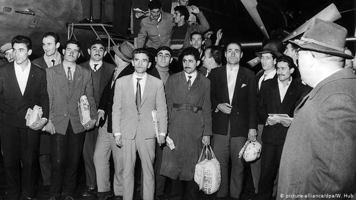
The next stage was to collect photograohs for the articles, the first ones i needed was the article for the turkish migration to UK, in this section i want to use the photograph on the right which is a image of turkish festival back in 2007you can see clearly the mixture of flags and the celebration with all of the iconic buildings at the back. I didnt know whether to use it as colour or black&white. The other image was the one on the left, which is an image showing the turkish men arriving to germany in 1961 which shows the guest worker scheme. The article mentions other migrations such as turkish and german relationshop so i thought this would be really interesting i found this photographs from one of the the articles.

I wanted to use the turkish festival image black and white to show the memory essence and it was more bold this way.

I started t create the first couple of pages, Im really happy with the layout of the first spreads on the right, the article is sits in two paragraphs and the image is half on the page with a pull out quote at the bottom. I think its clean and modern communicates the article i think the problems i had on my other draft was it was too much on the page the visuals i liked just didnt fit in with my style and my skills which is why i never felt like it was good but i feel way more confident now. The other spreads are the second page with the pull out quote this section i wanted to highlight the countries turkish people have lived in and the quote on the right. I used a dantel right in the middle as like a seperater but also connects the pages together just like in my house the dantel would just be just under or over everything.


This image is from a tv series in Turkish television that focuses on 90s turkish life and a drama about the family life in the day. You can see set decor all the laces under everything and on everything in the house its like a little extra protection thats the feel i want the lace just turning on page either randomly or as structured to create that homely living room feeling. A nostalgic feeling brings this publication is a core part of the project as well that runs through each page.

I also did some sketches on the first couple of spreads and the kind of content i want to have. The sketches are very quick and i focused on the visuals i had on my mind which were clean experimental but also straight to the point. I have to decide on my typeface as its a important part of the publication as discussed many times before. The spreads focus on article, large pull out quotes, language as full pages , and other different spreads to create a better tone of language. I think these skeches are great start for me to work on the other sections and im really confident with these layouts as im bringing everything i have worked on and seen in the process.
Things i want to focus on the first half of the publication
PART 1
history of turkish migration
home memory food article to show these feelings can also be positive. I dont want to include the stories of Lebanese people liek before as i think it makes it too confusing i realised i was trying to do too much add everything onto the pages and chucked all the contect together that may not work well together.
language- what is gurbet? where does it come?
Homeland has so many words in Turkish and home doesn’t mean home as in homely feeling in Turkish.
PART 2
interviews mum
interviews dad
Kurdish friend – I decided i want to use Kurdish culture in my publication because grew up with loads of kurdish friends and families around us so i want to also get their experience and see their journey as their traditional foods are different compared to turkish culture. I find it very fascinating and i do love their food. As growing up i realised our cultures do have some similarities especially the kurdish people from turkey both cultures felt like merges.

